Showing posts with label Color Choice. Show all posts

Sunday, September 29, 2013

Beginnings

I have started a new project.  This one will be easy as I am using the Hindia tutorial I purchased from Studio 183 on Etsy.  I love this pattern.

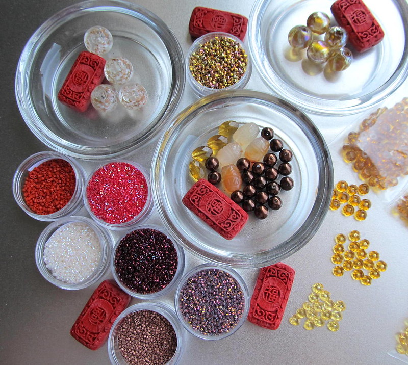
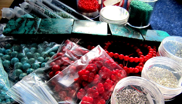
To begin, here is my project tray:
Hindia project tray
I began by choosing the center base beads, which are not in any of the pictures.  They are a very pale pink rose quartz 6 mm bead. Despite the fact that they have been in my bead stash for well over 20 years they have been well used; they are quite versatile and will soon need to be restocked.  I think next time I will go a shade darker on the pink.

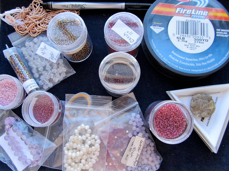
Getting to pink as a base color was a process of elimination. I use blue all the time and did not want to make something in blues again.  Black and white are wonderful, but did not fit for this particular project.  Green is one of my favorites, but for some reason it seemed to be over represented in my work.  I just finished a brightly colored piece so that ruled out oranges and yellows.  I always consider red, it really is my favorite, but I wasn't sure it would work in this piece because I did not know what other colors to use.  I decided on purple as it a popular choice, but I did not have enough of a choice in seed beads and embellishment beads to fit this project.  That left pink.

Once the pink was chosen I selected bronze and brass tones for balance, and just a touch of gold,  I picked plums and cranberries for additional color. 

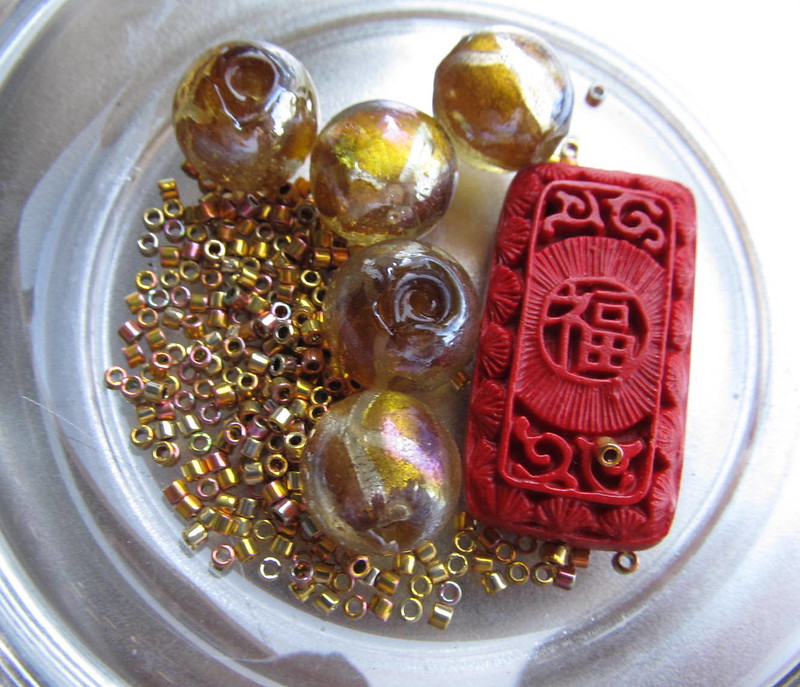
Now, my project tray does not show much other than the tools that I start with, minus my magnifying light.  Here is an overall view of my bead choices:
Hindia bead choices 
Here is a close up of the seed beads:
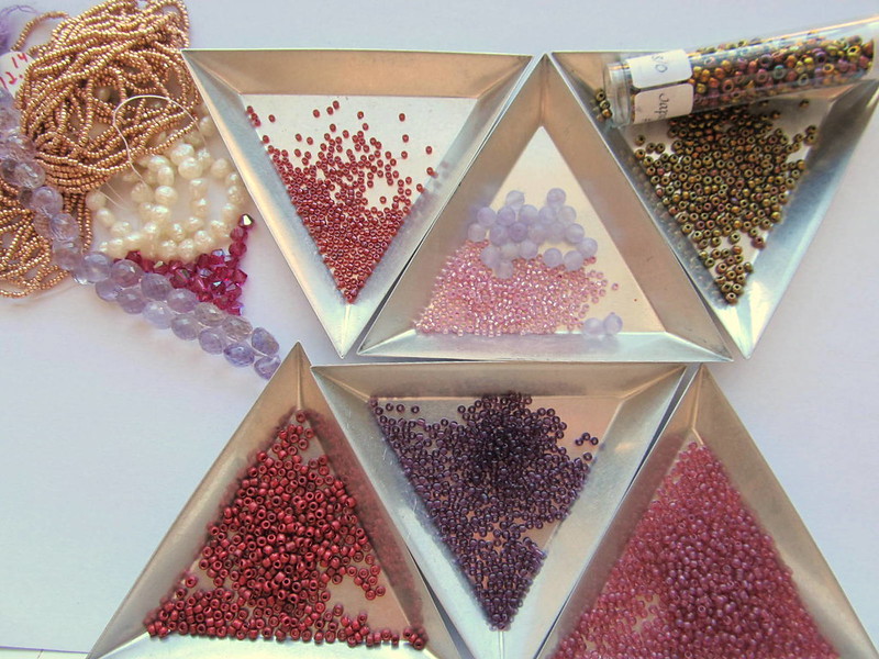
Hindia seed bead choices in 15, 11, and 8


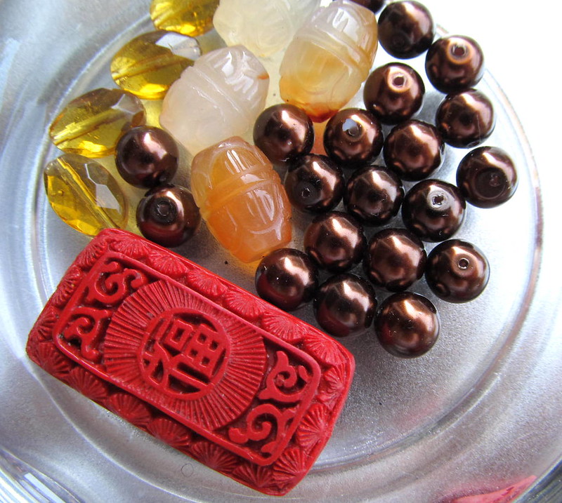
The embellishment beads are here:
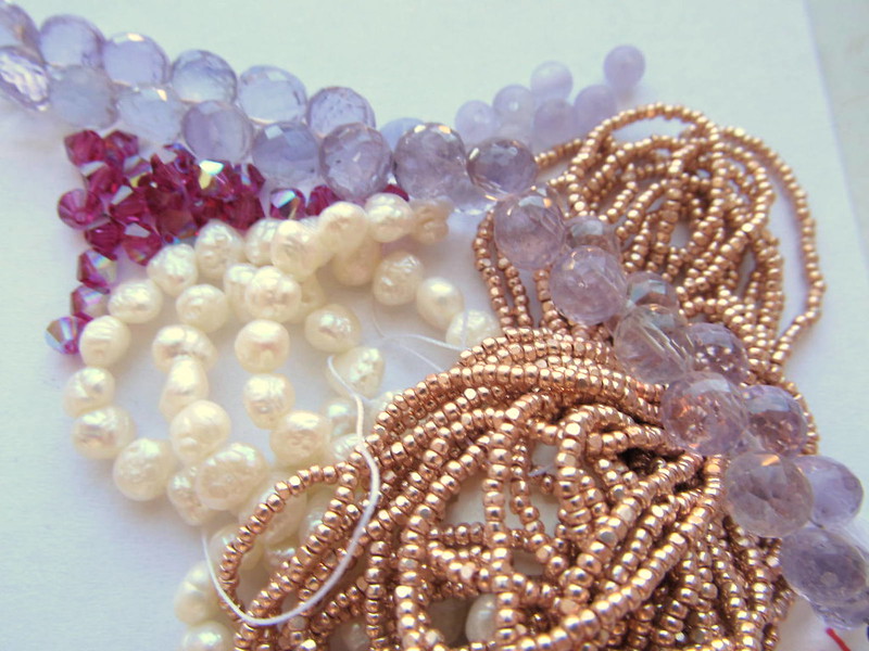
Hindia embellishment beads. 
The embellishment beads are pearls, size 15 charlottes in gold, pink amethyst onion cut briolettes, 4 mm amethyst rounds, and 4 mm swarovski bicones.

Gathering the intended beads only narrows down the choices, it does not end them.  I found that the pink swarovski bicones were too dark and I had no light pink 4 mm bicones.  (How did that happen with my huge bead stash???)  I substituted a brass cut bead that is almost a bicone.

Here is my work in progress:
Hindia work in Progress

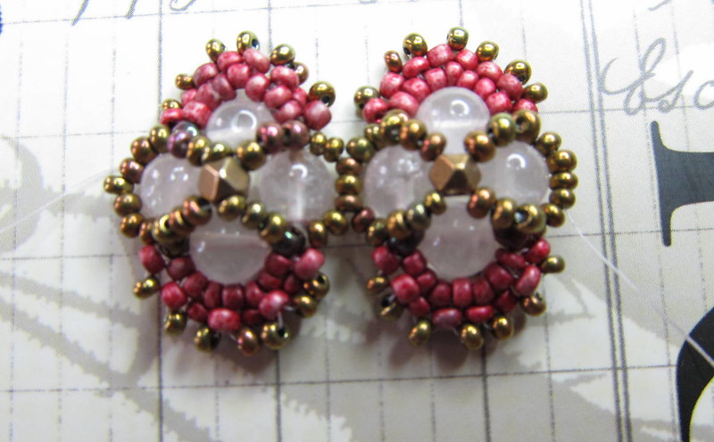
In the end, I opted for the cranberry seed beads; they were just too alluring to set aside on this project.

Geek Update:
Way back when I started this blog I saved all my pictures in Flickr and then posted them here via a URL link.  I am still doing that.  However, I also had a widget in the side panel that showed my most recent flickr updates.  That widget stopped working quite a while ago but I missed it.  Today I found a substitute in the flickr badge. 

If you use flickr, search for flickr badge and click through the steps.  Then in Blogger choose layout and the html gadget and paste the badge text.

I am glad to have my most recent flickr photos available again on the side bar.

Sunday, July 29, 2012

New Project

I don't know about you but the hardest part of each project for me is picking out colors.

Last week a friend of mine did a blog post about mood boards and I commented that I do not create mood boards or design boards.  Instead, I go through my beads and pull out what I think is appropriate for the project that I have in mind.

My next project is going to utilize a long cinnabar bead as the focal for a bracelet.  It will also include 24 kt gold iris Delicas.  Those are the only certain choices.

Here are all the starting choices:
Big mood board for cinnabar bracelet project

As I stated the only choice is the cinnabar and the gold iris Delicas.  Then, I need to make a choice between two secondary beads.  Here is the first option:
Secondary Bead with Delicas Cinnabar Mood Board Choice 1
I really like this option.  I like the gold foil in these beads, I like the visual texture, and I like the size.  This is likely to be my choice.

There is, however, a second option:
Secondary Bead with Delicas Cinnabar Mood Board Choice 2
It is difficult to tell from this picture, but these beads are mostly clear with clouds of gold dust and white swirled throughout.  The gold in these beads are a bit more visually delicate and will likely be a nice balance against the rest of the bracelet.

Both choices are viable.  I will make up my mind when I am ready to add them to the bracelet.

Planning ahead, I may be in need of a tertiary bead to round out the bracelet.  Here are my choices:
Tertiary Beads Cinnabar Mood Board

In this set of choices, I like the jade barrels, they pick up on the mood of the cinnabar focal but I don't think the color is going to be quite right.  The crystals are nice, but I think are a bit to yellow.  Finally, I am leaning toward to dark bronze beads.  Again, all options remain viable and I will make a choice if it becomes necessary.

Of course, there are going to be additional seed beads.  The gold iris beads are in the center of the picture below:
Delicas Cinnabar Mood Board
This is going to be a more limited choice.  The gold iris beads are a size 10.  I need to make two more choices, an 11/0 and a 15/0.

Finally, I do not have all that I need for the finished piece.  I need a gold tone clasp and some chain.  I need the chain because I want this bracelet to be adjustable in length.  *sigh*  You would think with all the beady stuff I own a trip to the bead store would be unnecessary.

Sunday, January 8, 2012

Torment

I don’t know about you, but I torment myself every time I need to choose a color palette.  I pick a main color with a secondary color in mind, but something about the secondary color does not work, e.g. no beads, wrong size, wrong finish, or just a bad match.  In this case I expected to use turquoise beads with my slab turquoise but all of my turquoise beads are too blue.  I intended to use red coral in this piece too, so I looked at my red beads, here I mostly ran into too pink and the wrong finish- I want a matte opaque for the colored beads.  Which brought me around to the choice I should have made in the first place, silver.  Of course I now have to choose between three shades of “silver:” bright silver, steel, and smokey opaque grey.  I think the steel is going to be my main silver. 

In addition, I chose some blues and greens for accents.  I also picked out all of my red coral (and one red glass) for larger accents.

This is why I have a whole set of bookmarks titled color.

Classic South Western color palette

I also went through a large stack of clippings for inspiration for the composition of the multi-strand part of the necklace.
A second view of the classic South Western color palette

Friday, September 23, 2011

Color

I can't tell you how many hours I spend agonizing over color choices. 

Because choosing colors takes a large portion of my design time I have pick up books on color theory, follow decorating blogs and enjoy decorating magazines for more than just the lush decor, hold the Pantone color forecasts in high regard, pay attention when I walk through Target (color is how Target gets me to part with so much cash) and love blogs that feature color palettes.

In my RSS feed I have a subcategory titled: Color.  Topping the list is Beverly Ash Gilbert.  One of my favorite references is Margie Deeb's The Beader's Guide to Color.  Which is why I was delighted when Beverly Ash Gilbert announced that she and Margie Deeb have teamed up and published a color journal.  Waste no time in visiting Beverly's blog to download their first journal: Ask the Color Queens