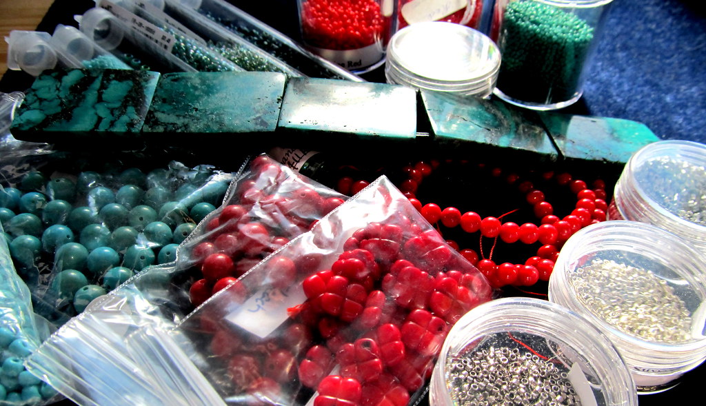
I don’t know about you, but I torment myself every time I need to choose a color palette. I pick a main color with a secondary color in mind, but something about the secondary color does not work, e.g. no beads, wrong size, wrong finish, or just a bad match. In this case I expected to use turquoise beads with my slab turquoise but all of my turquoise beads are too blue. I intended to use red coral in this piece too, so I looked at my red beads, here I mostly ran into too pink and the wrong finish- I want a matte opaque for the colored beads. Which brought me around to the choice I should have made in the first place, silver. Of course I now have to choose between three shades of “silver:” bright silver, steel, and smokey opaque grey. I think the steel is going to be my main silver.
In addition, I chose some blues and greens for accents. I also picked out all of my red coral (and one red glass) for larger accents.
This is why I have a whole set of bookmarks titled color.
 |
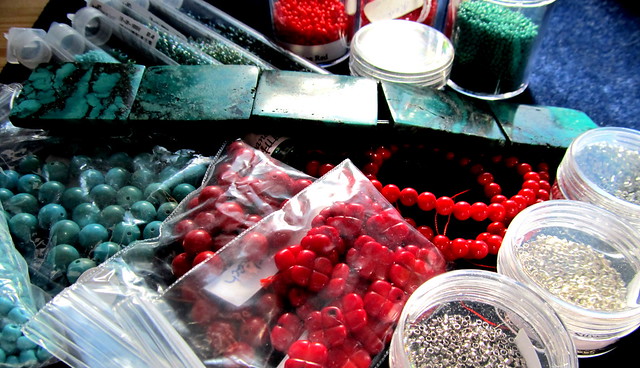
| Classic South Western color palette |
I also went through a large stack of clippings for inspiration for the composition of the multi-strand part of the necklace.
 |
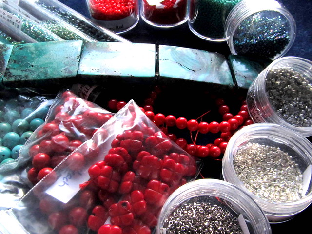
| A second view of the classic South Western color palette |
Oooh, can't wait to see how it all comes together! The palette looks great.
ReplyDeleteI can't wait to see how it comes together too. I have the structure figured out, and now the palette, next I will test a few details.
ReplyDeleteI will love to see where you take these and your surprise when you realize you did awesome choosing the "right" palette!
ReplyDeleteThanks Kristen, I fell in love with the turquoise so I don't mind spending the time to make it shine.
ReplyDelete